How to Make a Sightly To-Do List

Here is a detailed guide about how to make a to-do list that is not only useful but also pleasing and attractive to see. This is a simple and easy way which has automated many steps. If you have a slight to-do list, it can not only remind you of primary tasks but also please your eye and give you joy. Edraw allows you to gain such results with powerful functions. If you haven’t got Edraw, click here to download it.
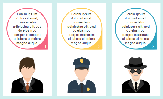
To-Do List Example

To-do List Template

Steps To Make a To-Do List

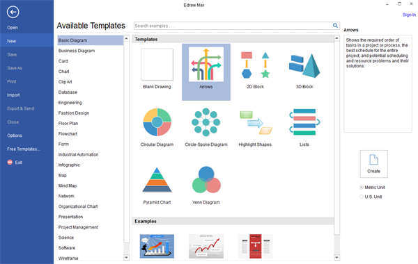
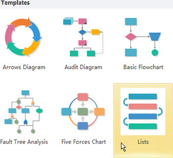
To begin with, open Edraw and the libraries needed. We need List, Callout, Priority shapes and illustrations of people to draw the above examples. Follow these steps: Start Edraw. -> Double click Lists in the Templates window. -> The list libraries open on the left side of the window.

open list template

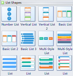
Click List Shape title and drag the 12th shape onto the canvas.

list shapes

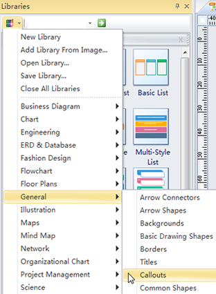
To open other libraries: Enter Priority in the search box above the opened libraries -> Click Libraries button and scroll down to choose General type -> Select Callout – Open People in Illustration group and background in General group similarly. -> Drag all necessary shapes into the diagram.

open callout library

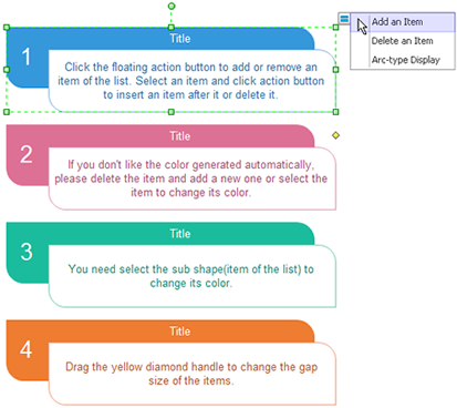
Secondly, adjust the shapes. Rest the pointer over the shape. -> Point towards the floating button. -> Click Add an Item 3 times to add 3 more sub-shapes.

make to-do list

Double click the text box to add time and corresponding tasks in each text box. -> Format the text.

Then specify a priority. Click priority title. -> Drag one Priority shape to the right side of a sub-shape. -> Click its floating action button to change priority degree. Do it similarly to drag background, people illustrations and callouts to add a description to tasks.

make to-do list

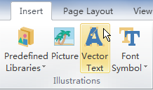
Last but not least, design a catchy headline. Click Insert menu. -> Use Vector Text function to make a more beautiful title.

make to-do list

Here you go. You can have a sightly to-do list in less than 10 minutes. Print it and it becomes portable. You can make a modification to it the next day again and again. You will embrace endless possibilities as long as you try.

Read More:

How to Make a Sightly To-Do List

Quickly Learn How to Draw Basic Vector Lines with an Easy Diagram Software

Vector graphics are made up of lines and curves defined by mathematical objects called vectors, which describe an image according to its geometric characteristics.

About Vector Graphics

Vector graphics (sometimes called vector shapes or vector objects) are made up of lines and curves defined by mathematical objects called vectors, which describe an image according to its geometric characteristics. Vector graphics are also resolution-independent – they maintain crisp edges when resized, printed to a PostScript printer, saved in a PDF file, or imported into a vector-based graphics application. As a result, vector graphics are the best choice for artwork, such as logos, which will be used at various sizes and in various output media.

About Paths

As you draw, you create a line called a path. A path is made up of one or more straight or curved segments. The beginning and end of each segment are marked by anchor points which work like pins holding a wire in place. A path can be closed (for example, a circle), or open, with distinct endpoints (for example, a wavy line).

You change the shape of a path by dragging its anchor points, the direction points at the end of direction lines that appear at anchor points, or the path segment itself.

Components of a Path

A. Unselected anchor point  B. Selected anchor point  C. Direction point  D. Direction line  E. Straight segment  F. Curved segment

Paths can have two kinds of anchor points: corner points and smooth points. At a corner point, a path abruptly changes direction. At a smooth point, path segments are connected as a continuous curve. You can draw a path using any combination of corner and smooth points. If you draw the wrong kind of the point, you can always change it.

Points on a Path

A. Four corner points  B. Four smooth points  C. Combination of the corner and smooth points

A corner point can connect any two straight or curved segments, while a smooth point always connects two curved segments.

A corner point can connect both straight segments and curved segments.

About Direction Lines and Direction Points

When you select an anchor point that connects curved segments (or select the segment itself), the anchor points of the connecting segments display direction handles, which consist of direction lines that end in direction point. The angle and length of the direction lines determine the shape and size of the curved segments. Moving the direction points reshapes the curves. Direction lines don’t appear in the final output.

After selecting an anchor point (left), direction lines appear on any curved segments connected by the anchor point (right).

A smooth point always has two direction lines, which move together as a single, straight unit. When you move a direction line on a smooth point, the curved segments on both sides of the point are adjusted simultaneously, maintaining a continuous curve at that anchor point.

In comparison, a corner point can have two, one, or no direction lines, depending on whether it joins two, one, or no curved segments, respectively. Corner point direction lines maintain the corner by using different angles. When you move a direction line on a corner point, only the curve on the same side of the point as that direction line is adjusted.

Adjusting direction lines on a smooth point (left) and a corner point (right)

Direction lines are always tangent to (perpendicular to the radius of) the curve at the anchor points. The angle of each direction line determines the slope of the curve, and the length of each direction line determines the height or depth of the curve.

Find out More:

Drawing Basics

80+ Callout Elements for Better Infographics Design

Callout elements are extremely useful in infographics when you want to add bubble speech or popup explanation. This page gives you a collection of 80+ callout elements and icons which will add beauty and charm to your infographics. No matter you want to add a bubble speech or a small popup annotation, you need to use them. Using appropriate callouts can make your infographic more captivating. You can also view more vector infographic elements.

Infographic Callout Elements

Most of us are only familiar with the ellipse and cloud callout. However, there are much more styles than we could think of. Like the picture shows below, over 80 callout shapes are prepared to help you with the presentation of your infographic. You can choose any of them and amend the colors to fit your own infographic theme.

infographics callout elements

Free download infographic software and use all callout elements:

Application of Callout Shapes in Infographics

Here are 3 callout element application samples. The first one uses callout to present bubble speech.

apply callout in infographics

Below the picture uses the rectangle shape and a line as a callout. This kind of callout is usually used for adding annotations.

infographics callout application

This image uses 3 same callout shapes to present list contents.

use callout in infographic

Read More:

80+ Callout Elements for Better Infographics Design


How to Create a Force Field Analysis Diagram

“If you want truly to understand something, try to change it.”

—-Kurt Lewin (Developer of Force Field Analysis)

Are you struggling with some changes in your life? Do you have hesitations about whether to make a change or not? A Force Field Analysis might be able to help you get moving!

Force Field Analysis is one of the great tools to manage change to achieve a certain goal at work or in daily life. Click here to see the definition of Force Field Analysis to get a full understanding of how FFA can help manage changes in life.

How to Use Force Field Analysis

Step 1: Determine the Problem and Aim

What is the part that needs to be changed about the current situation? What kind of result do we need to reach after the change?

Step 2: Identify the Driving Forces

What are the forces that would support the change of situation and to get to the desired aim? How can those forces help? Place those driving forces on the one side of the Force Field Analysis diagram, with arrows pointing to the center. Are there any inter-relationships among those driving forces? Have a good analysis.

Step 3: Identify the Restraining Forces

What are the forces that prevent the proposed change from developing and maintain the current status? Place those forces on the other side of the Force Field Analysis diagram. Are there any inter-relationships among those forces?

Step 4: Decide if the Change is Practical

After listing the driving forces and restraining forces on the Force Field Analysis diagram, compare them and decide if it is realistic to put the proposed change into action.

Edraw is a professional and easy-to-use diagram software that can help you create a Force Field Analysis diagram without drawing skills required. It contains a large set of ready-made symbols that suit every theme.

Create a Force Field Analysis Diagram

1. Follow the instruction and open a new diagram drawing page: Available Templates – Basic Diagram – Arrows. Double click to get started with the designing of your new Force Field Analysis Diagram.

Open a New Page for Force Field Analysis Diagram

2. Add Arrows: drag and drop arrows that suit the subject to the drawing page. Sizes and colors of the arrows can be modified accordingly.

Add and Modify Arrows for Force Field Analysis Diagram

Tip: Use “Rotate & Flip” button to change the direction of arrows.

Rotate and Flip Buttton

3. Complete the Diagram: type in text for each arrow. The arrow at the center represents the “Problem or Issue” that needs to be evaluated, arrows on the left represents “Driving Forces” and arrows on the right represent “Restraining Forces”.

Example of Force Field Analysis Diagram

Tips: Give each force a score then add them up. As in this diagram, the total score for “Driving Forces” are 9, and for “Restraining Forces” are 8. After the assumption, you can make a decision about whether take the action or not,

4. Save and Export: once completed the design of your Force Field Analysis Diagram, save the file or export it as other formats if necessary.

More Information

How to Create a Force Field Analysis Diagram

Quickly Go Through this Full Venn Diagram Guide

Venn diagram uses circles to represent sets, and its position and overlap of the circles indicate the relationships between the sets. Venn diagrams are commonly used in the teaching work in order to encourage students to recognize complex relationships between two or more things.

The Definition of a Venn Diagram

Venn diagram is an illustration that uses overlapping or non-overlapping circles to show the relationship between a finite collection of sets. Where the circles overlap, items have a specified something in common. Some even refer to Venn diagrams as the overlapping circle’s charts or double bubbles charts.

Venn Diagram Example

Venn diagram is an illustration of the relationships between and among sets, groups of objects that share something in common. Venn diagrams are a type of graphic organizer which consists of overlapping circles. It shows all possible logical relations.

Application of Venn Diagram

As most of you already know, with the help of Venn diagrams, you can arrange all your abstract ideas easily. They’re excellent when it comes to making comparisons between groups of things. Venn diagrams are usually used for solving math problems which demand logical thinking and deductive reasoning, thus Venn diagrams act as an important tool in K-12 Education.

Venn diagrams show relationships, clarify concepts, and facilitate communication. Venn diagrams do not just restrict its use to classroom learning, but also used extensively in other disciplines. It’s a great tool for organizing, evaluating and representing complex relationships visually.

Let us see how to use a Venn diagram to solve a math problem. Of the people in Lily’s neighborhood, 4 have been to New York. 6 people have been to Los Angeles. 2 people have been to both New York and Los Angeles. How many people have been to New York but not Los Angeles?

Using Venn Diagram

Brief History of Venn Diagram

Venn diagram gets its name from British mathematician, John Venn, who introduced the illustration. In 1880, Cambridge fellow John Venn presented his paper “On the Diagrammatic and Mechanical Representation of Propositions and Reasonings.” This work ultimately secured his position as the namesake of Venn diagrams. Venn’s body of work includes his 1881 treatise “Symbolic Logic” as well as “The Principles of Empirical Logic,” which he wrote in 1889.

Venn Diagram Example

The first use of the term Venn diagram did not occur until many years after Venn delivered his paper. The term “Venn diagram” appears in “A Survey of Symbolic Logic” by Clarence Irving Lewis, published in 1918.

You can view a brief Venn diagram guide through slides. Click here to download the ppt template of Venn Diagram Guide.

Examples of Venn Diagram

A Venn diagram uses intersecting circles to illustrate the similarities, differences, and relationships between groups. Similarities between groups are represented in the intersecting portions of the circles, while differences are represented in the non-intersecting portions of the circles.

Venn Diagram Example

Steps to Make a Venn Diagram

Although it is convenient to use Venn diagrams to clarify things, drawing Venn diagrams by hand is not that easy. No worries, you can quickly and correctly draw a Venn diagram with the help of Venn diagram maker. Let me show you how to use a Venn diagram maker to draw a Venn diagram.

First things first, you need to choose a Venn diagram shape you like from the library which is on the left of the canvas.

Select Venn Shape

Drag and drop the Venn diagram shape you have chosen on the drawing page. Double click each circle to edit the text in the Venn diagram.

Edit Venn Diagram Text

If you want to delete or add a circle, please find the floating button which is around the bottom of the top circle.

Find Venn Diagram Floating Button

When you choose “Show Center” option, the center circle will appear like the picture below shows.

Show Venn Diagram Center

Read More:

Complete Venn Diagram Guide